图解CSS3 Flexbox各种属性的用法和效果
Flexbox布局,正式的叫法是 CSS Flexible Box Layout Module 。它是CSSS3里引入的一种新布局,旨在更方便的对容器里的元素进行排列、对齐、排序等,尤其是当不知道他们的大小或者动态尺寸的时候。具有flex布局特征的元素的基本特征是,它能在不同的屏幕尺寸下让它的子元素以最佳的布局填充整个有效空间。
很多网页设计师和Web开发者都发现,flex布局非常容易使用,通过简单的代码能对元素进行复杂的定位布局,使网页开发变得更高效。Flexbox布局算法的中心思想是方向,这跟以往的block和inline的纵向和横向布局不同。flexbox布局适合用在页面里的小元素上,如果是大方面的布局,使用 CSS Grid Layout Module 更合适。
本文并不是试图讲解flexbox布局里的各种属性如何工作,而是用图解的方式介绍flexbox里的各种属性和属性值如何让布局起变化,以及如何变化。
在开始介绍flexbox的各种属性前,让我们先了解一下flexbox模型。flexbox布局由一个父元素容器( flex容器 )和它的直接子元素( flex子元素 )组成。
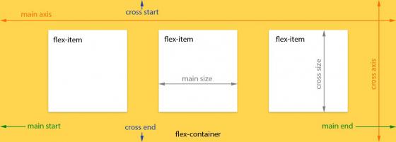
在上面的图表中,我们看到了用来描述flex父容器和flex子元素的各种属性和属于的叫法。其它更多的语义你可以参考官方 flexbox model 文档。
flexbox布局的规范从2009年起,经历了数次修订和变更,所以,为了避免混淆,我们使用的语法都是来自最近的最新规范草案(2014年9月)。
各种浏览器对最近出了的flexbox规范的兼容情况
- Chrome 29+
- Firefox 28+
- Internet Explorer 11+
- Opera 17+
- Safari 6.1+ (prefixed with
-webkit-) - Android 4.4+
- iOS 7.1+ (prefixed with
-webkit-)
你还可以从 这里 查看详细的浏览器支持和 兼容情况。
想要实现flexbox布局,我们只需要修改一下网页元素的 display 属性:
.flex-container {
  display: -webkit-flex; /* Safari */
  display: flex;
}
对于inline元素,可以这样写:
.flex-container {
  display: -webkit-inline-flex; /* Safari */
  display: inline-flex;
}
注意:你只需要给父元素添加这一个属性,它的所有直接子元素都会自动成为flex子元素。
可以有很多方式来划分flexbox的各种属性,但目前为止,我们发现,这最简单易懂的方式是把这些属性分成flex父容器属性和flex子元素属性两组。下面,我们就开始用图像来解释这些属性是如何影响布局的。
# 针对Flexbox父容器元素的属性
This property specifies how flex items are laid out in the flex container, by setting the direction of the flex container’s main axis. They can be laid out in two main directions, like rows horizontally or like columns vertically.
可选值:
.flex-container {
  -webkit-flex-direction: row; /* Safari */
  flex-direction:         row;
}
With row direction the flex items are stacked in a row from left-to-right in ltr context 
.flex-container {
  -webkit-flex-direction: row-reverse; /* Safari */
  flex-direction:         row-reverse;
}
With row-reverse direction the flex items are stacked in a row from right-to-left in ltr context 
.flex-container {
  -webkit-flex-direction: column; /* Safari */
  flex-direction:         column;
}
With column direction the flex items are stacked in a column from top-to-bottom 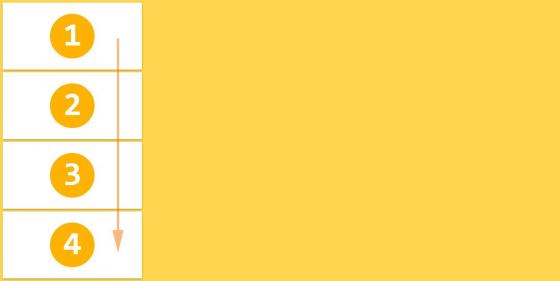
.flex-container {
  -webkit-flex-direction: column-reverse; /* Safari */
  flex-direction:         column-reverse;
}
With column-reverse direction the flex items are stacked in a column from bottom-to-top 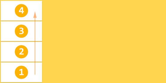
缺省值: row
注意: row and row-reverse are dependent of the writing mode so in rtl context they will be reversed respectively.
The initial flexbox concept is the container to set its items in one single line. The flex-wrap property controls if the flex container lay out its items in single or multiple lines, and the direction the new lines are stacked in.
可选值:
.flex-container {
  -webkit-flex-wrap: nowrap; /* Safari */
  flex-wrap:         nowrap;
}
Flex items are displayed in one row, by default they are shrunk to fit the flex container’s width 
.flex-container {
  -webkit-flex-wrap: wrap; /* Safari */
  flex-wrap:         wrap;
}
Flex items are displayed in multiple rows if needed from left-to-right and top-to-bottom 
.flex-container {
  -webkit-flex-wrap: wrap-reverse; /* Safari */
  flex-wrap:         wrap-reverse;
}
Flex items are displayed in multiple rows if needed from left-to-right and bottom-to-top 
缺省值: nowrap
注意:These properties are dependent of the writing mode so in rtl context they will be reversed respectively.
This property is a shorthand for setting the flex-direction and flex-wrap properties.
可选值:
.flex-container {
  -webkit-flex-flow: <flex-direction> || <flex-wrap>; /* Safari */
  flex-flow:         <flex-direction> || <flex-wrap>;
}
缺省值: row nowrap
The justify-content property aligns flex items along the main axis of the current line of the flex container. It helps distribute left free space when either all the flex items on a line are inflexible, or are flexible but have reached their maximum size.
可选值:
.flex-container {
  -webkit-justify-content: flex-start; /* Safari */
  justify-content:         flex-start;
}
Flex items are aligned to the left side of the flex container in ltr context 
.flex-container {
  -webkit-justify-content: flex-end; /* Safari */
  justify-content:         flex-end;
}
Flex items are aligned to the right side of the flex container in ltr context 
.flex-container {
  -webkit-justify-content: center; /* Safari */
  justify-content:         center;
}
Flex items are aligned at the center of the flex container 
.flex-container {
  -webkit-justify-content: space-between; /* Safari */
  justify-content:         space-between;
}
Flex items are displayed with equal spacing between them, first and last flex items are aligned to the edges of the flex container 
.flex-container {
  -webkit-justify-content: space-around; /* Safari */
  justify-content:         space-around;
}
Flex items are displayed with equal spacing around every flex item, even the first and last flex items 
缺省值: flex-start
Flex items can be aligned in the cross axis of the current line of the flex container, similar to justify-content but in the perpendicular direction. This property sets the default alignment for all flex items, including the anonymous ones.
可选值:
.flex-container {
  -webkit-align-items: stretch; /* Safari */
  align-items:         stretch;
}
Flex items fill the whole height (or width) from cross start to cross end of the flex container 
.flex-container {
  -webkit-align-items: flex-start; /* Safari */
  align-items:         flex-start;
}
Flex items are stacked to the cross start of the flex container 
.flex-container {
  -webkit-align-items: flex-end; /* Safari */
  align-items:         flex-end;
}
Flex items are stacked to the cross end of the flex container 
.flex-container {
  -webkit-align-items: center; /* Safari */
  align-items:         center;
}
Flex items are stacked to the center of the cross axis of the flex container 
.flex-container {
  -webkit-align-items: baseline; /* Safari */
  align-items:         baseline;
}
Flex items are aligned in a way that their baselines are aligned 
缺省值: stretch
注意:Read more details about how baselines are calculated here .
The align-content property aligns a flex container’s lines within the flex container when there is extra space in the cross-axis, similar to how justify-content aligns individual items within the main-axis.
可选值:
.flex-container {
  -webkit-align-content: stretch; /* Safari */
  align-content:         stretch;
}
Flex items are displayed with distributed space after every row of flex items 
.flex-container {
  -webkit-align-content: flex-start; /* Safari */
  align-content:         flex-start;
}
Flex items are stacked toward the cross start of the flex container 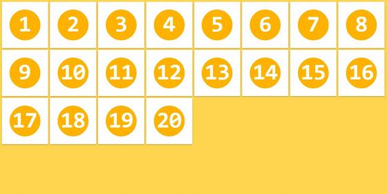
.flex-container {
  -webkit-align-content: flex-end; /* Safari */
  align-content:         flex-end;
}
Flex items are stacked toward the cross end of the flex container 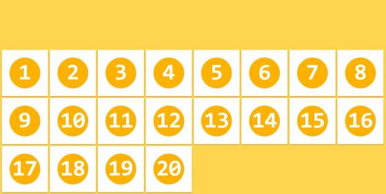
.flex-container {
  -webkit-align-content: center; /* Safari */
  align-content:         center;
}
Rows of flex items are stacked in the center of the cross axis of the flex container 
.flex-container {
  -webkit-align-content: space-between; /* Safari */
  align-content:         space-between;
}
Rows of flex items are displayed with equal spacing between them, first and last rows are aligned to the edges of the flex container 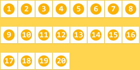
.flex-container {
  -webkit-align-content: space-around; /* Safari */
  align-content:         space-around;
}
Flex items are displayed with equal spacing around every row of flex items. 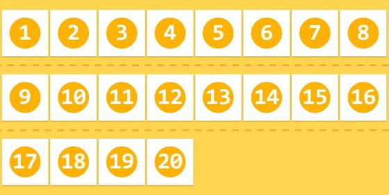
缺省值: stretch
注意:This property has only effect when the flex container has multiple lines of flex items. If they are placed in single line this property has no effect on the layout.
# Note for flex containers
- all of the
column-*properties have no effect on a flex container. - the
::first-lineand::first-letterpseudo-elements do not apply to flex containers.
# 针对Flexbox子元素的属性
The order property controls the order in which children of a flex container appear inside the flex container. By default they are ordered as initially added in the flex container.
可选值:
.flex-item {
  -webkit-order: <integer>; /* Safari */
  order:         <integer>;
}
Flex items can be reordered with this simple property, without restructuring the HTML code 
缺省值: 0
This property specifies the flex grow factor, which determines how much the flex item will grow relative to the rest of the flex items in the flex container when positive free space is distributed.
可选值:
.flex-item {
  -webkit-flex-grow: <number>; /* Safari */
  flex-grow:         <number>;
}
If all flex items have same value for flex-grow than all items have same size in the container 
缺省值: 0
注意:Negative numbers are invalid.
The flex-shrink specifies the flex shrink factor, which determines how much the flex item will shrink relative to the rest of the flex items in the flex container when negative free space is distributed.
可选值:
.flex-item {
  -webkit-flex-shrink: <number>; /* Safari */
  flex-shrink:         <number>;
}
By default all flex items can be shrunk, but if we set it to 0 (don’t shrink) they will maintain the original size 
缺省值: 1
注意:Negative numbers are invalid.
This property takes the same values as the width and height properties, and specifies the initial main size of the flex item, before free space is distributed according to the flex factors.
可选值:
.flex-item {
  -webkit-flex-basis: auto | <width>; /* Safari */
  flex-basis:         auto | <width>;
}
flex-basis is specified for the 4th flex item and dictates the initial size of the element 
缺省值: auto
注意:There is a naming issue with the auto value which will be resolved in future.
This property is the shorthand for the flex-grow , flex-shrink and flex-basis properties. Among other values it also can be set to auto ( 1 1 auto ) and none ( 0 0 auto ).
.flex-item {
  -webkit-flex: none | auto | [ <flex-grow> <flex-shrink>? || <flex-basis> ]; /* Safari */
  flex:         none | auto | [ <flex-grow> <flex-shrink>? || <flex-basis> ];
}
缺省值: 0 1 auto
注意:W3C encourages to use the flex shorthand rather than the separate component properties, as the shorthand correctly resets any unspecified components to accommodate common uses .
This align-self property allows the default alignment (or the one specified by align-items ) to be overridden for individual flex items. Refer to align-items explanation forto understand the available values.
可选值:
.flex-item {
  -webkit-align-self: auto | flex-start | flex-end | center | baseline | stretch; /* Safari */
  align-self:         auto | flex-start | flex-end | center | baseline | stretch;
}
The 3rd and 4th flex items have overridden alignment through the align-self property 
缺省值: auto
注意:The value of auto for align-self computes to the value of align-items on the element’s parent, or stretch if the element has no parent.
-
float,clearandvertical-alignhave no effect on a flex item, and do not take it out-of-flow.
你可以从 GitHub 上获取测试也的源代码。





![[HBLOG]公众号](https://www.liuhaihua.cn/img/qrcode_gzh.jpg)

